ALMUB DESIGN
RYAN CARAVEO
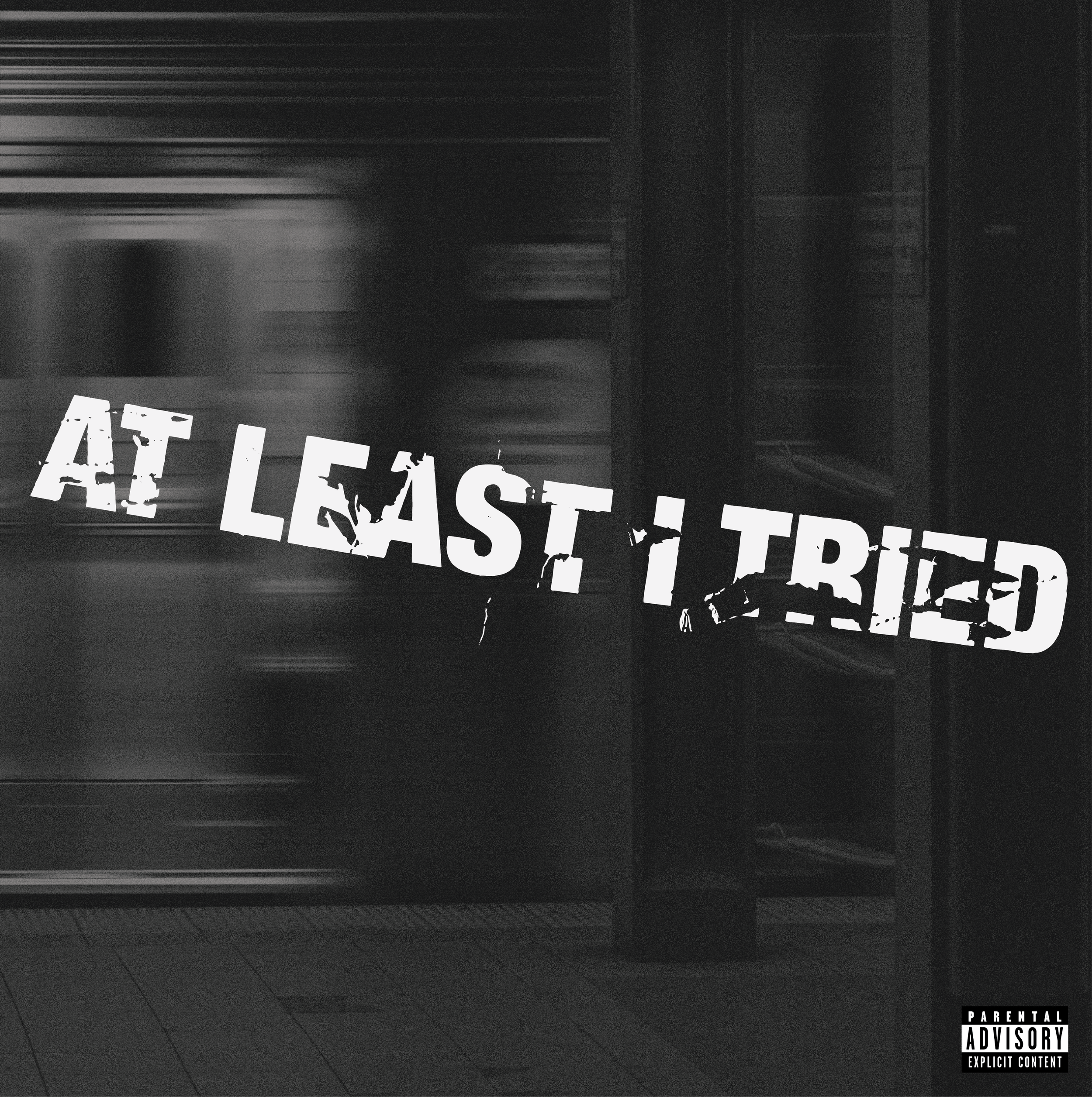
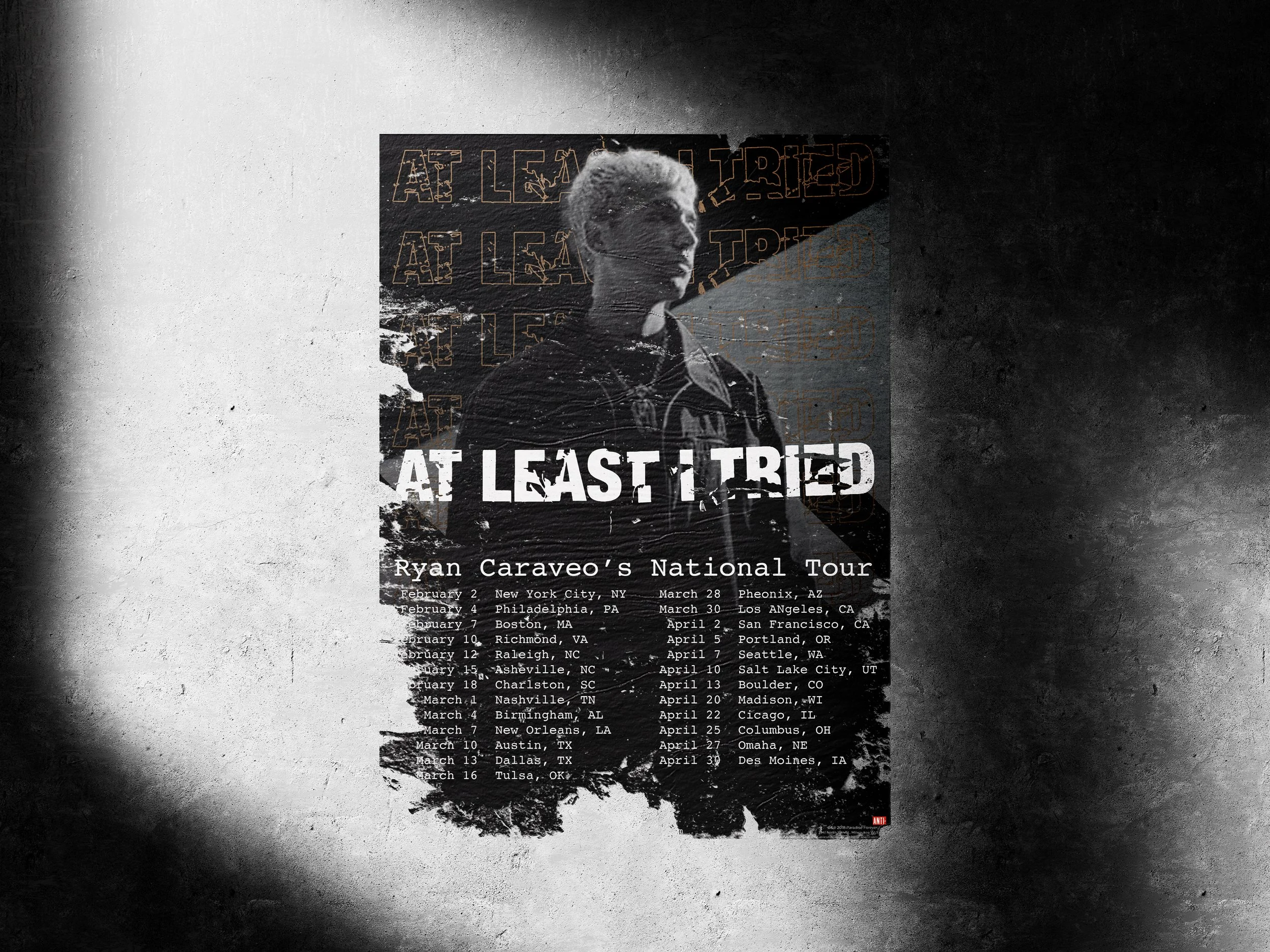
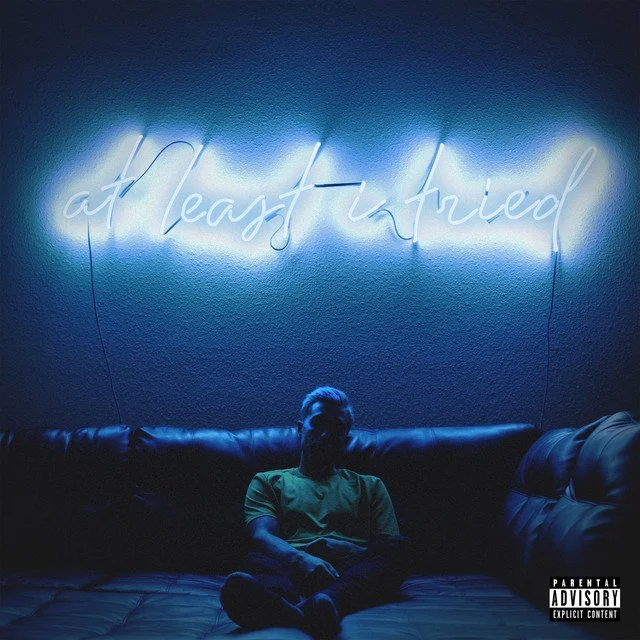
AT LEAST I TRIED
ABOUT
This class project was led by a working designer in the music industry. As part of a rotating class of working professionals, this project was taught as a way to better understand how to show emotion of music through design, while ensuring the visuals effects the feelings of the music.
AT LEAST I TRIED
·
RYAN CARAVEO
·
AT LEAST I TRIED · RYAN CARAVEO ·
MY PROCESS
-
LISTENING
I started this project by listening to this album on repeat 2-3 times all the way through.
-
BRAINSTORMING
Next came listening to the album while writing about different thoughts, feelings, and words that came to mind.
-
DRAFT
This part was focused on iterations, play, and the constant evolution of the final product.
-
FINALIZE
After refinement, “deliver” the newly designed album cover and be able to explain why specific choices were made.
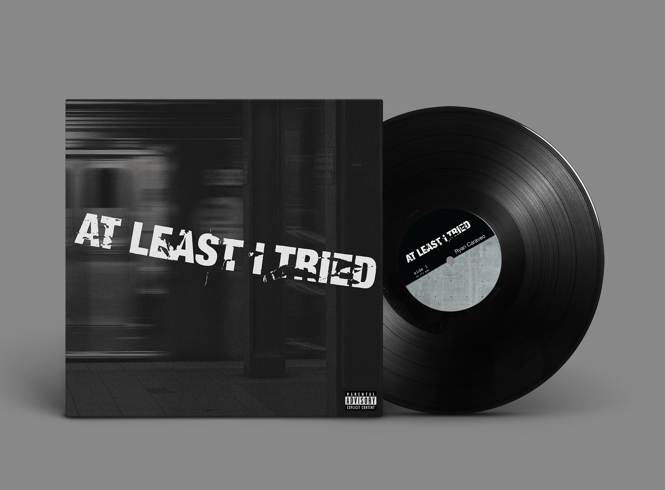
FINAL VERSIONS
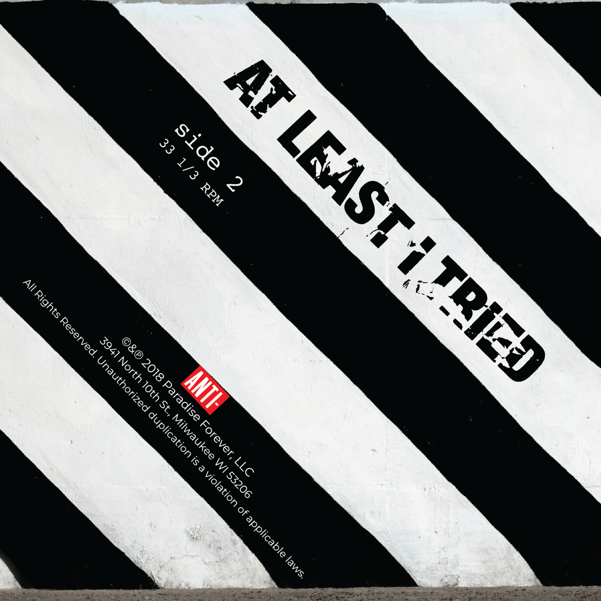
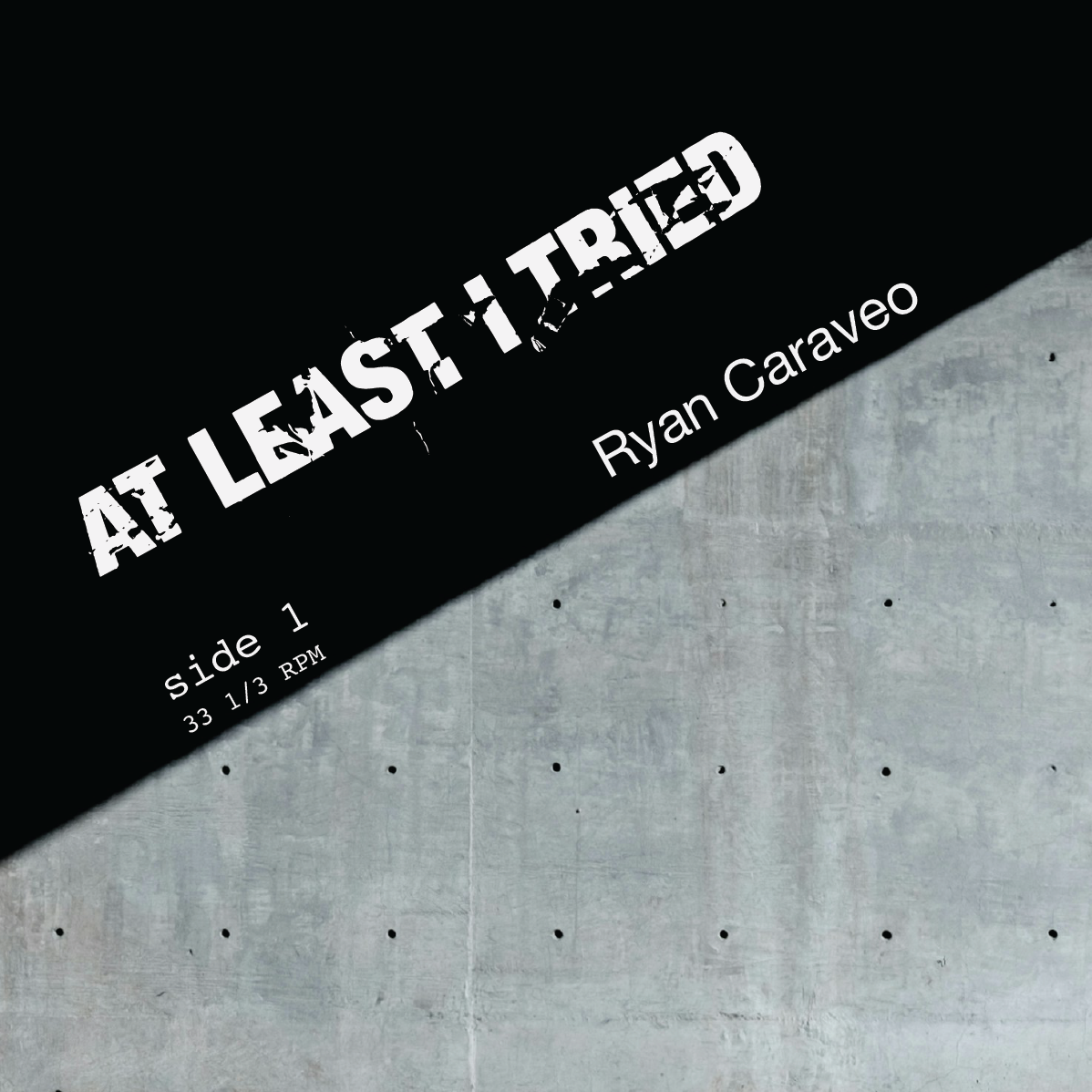
Front Cover and Side 1 (above)
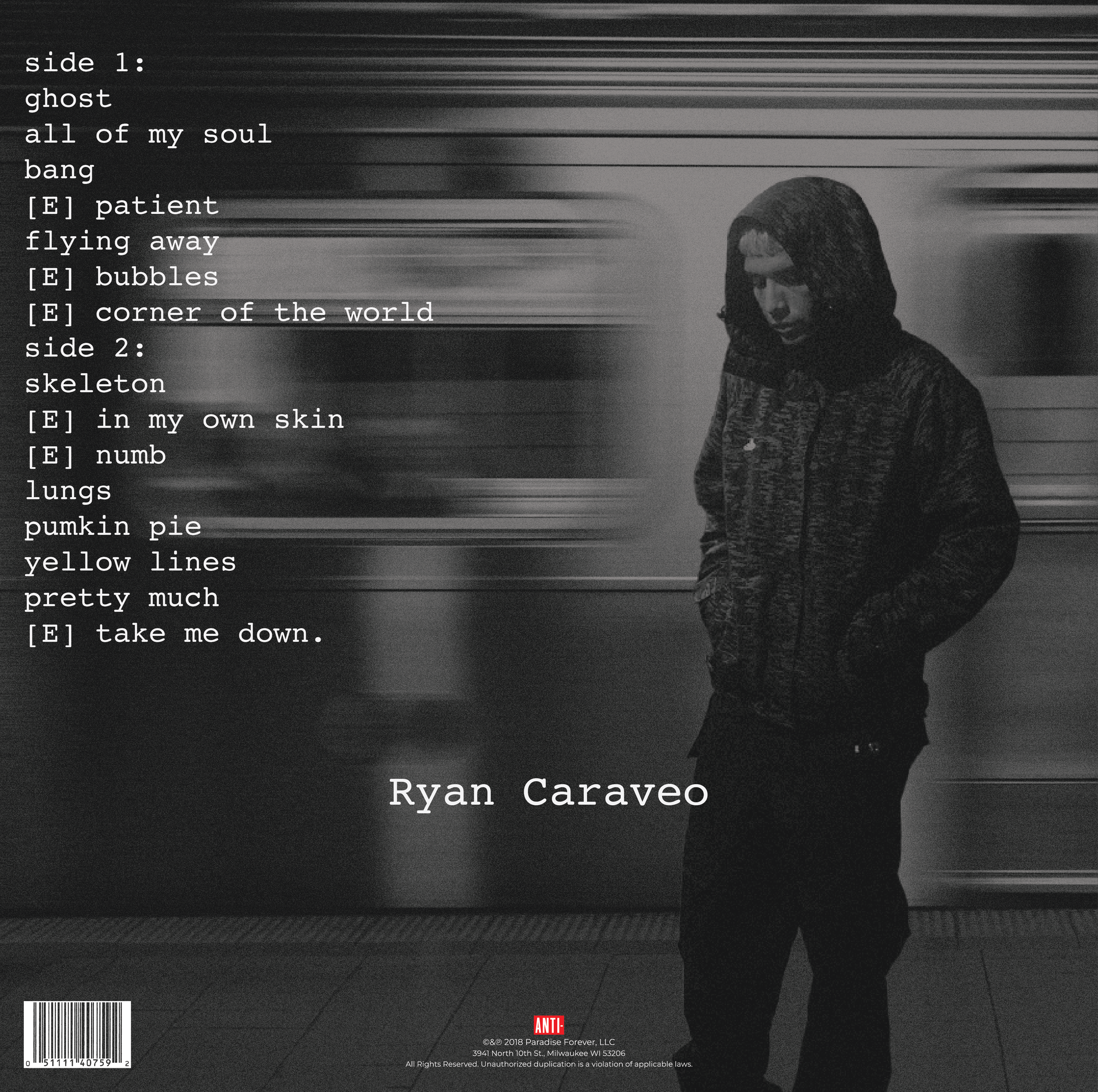
Back Cover and Side 2 (below)
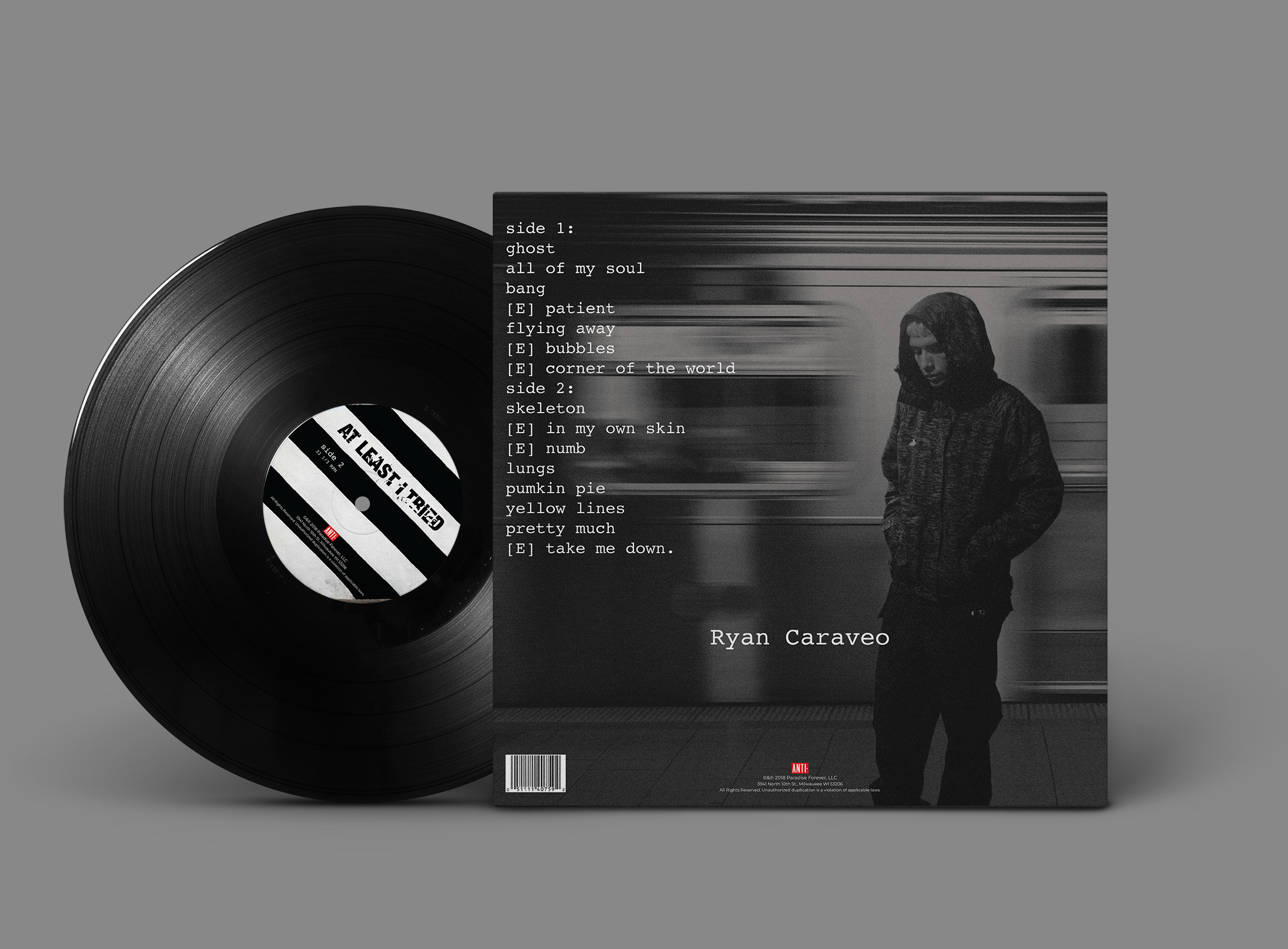
The overall tone of At Least I Tried is a mixture of melancholy and hope. While many songs reflect on emotional struggle and inner conflict, there’s a persistent effort to overcome these difficulties. The album feels like a journey through personal pain, yet it also leaves room for optimism and resilience.
Choosing to utilize no color was intentional to reflect the starkness and honesty throughout the album. The grain, lack of color, and “grungy” type, all work together to emphasize a raw and personal sense of isolation.