A Conceptual Project
The Inspiration
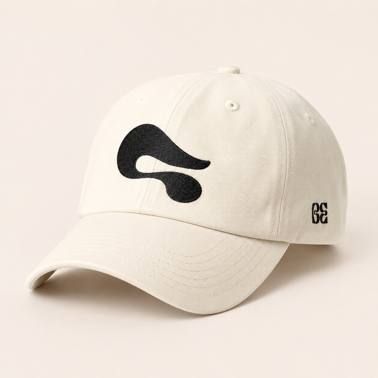
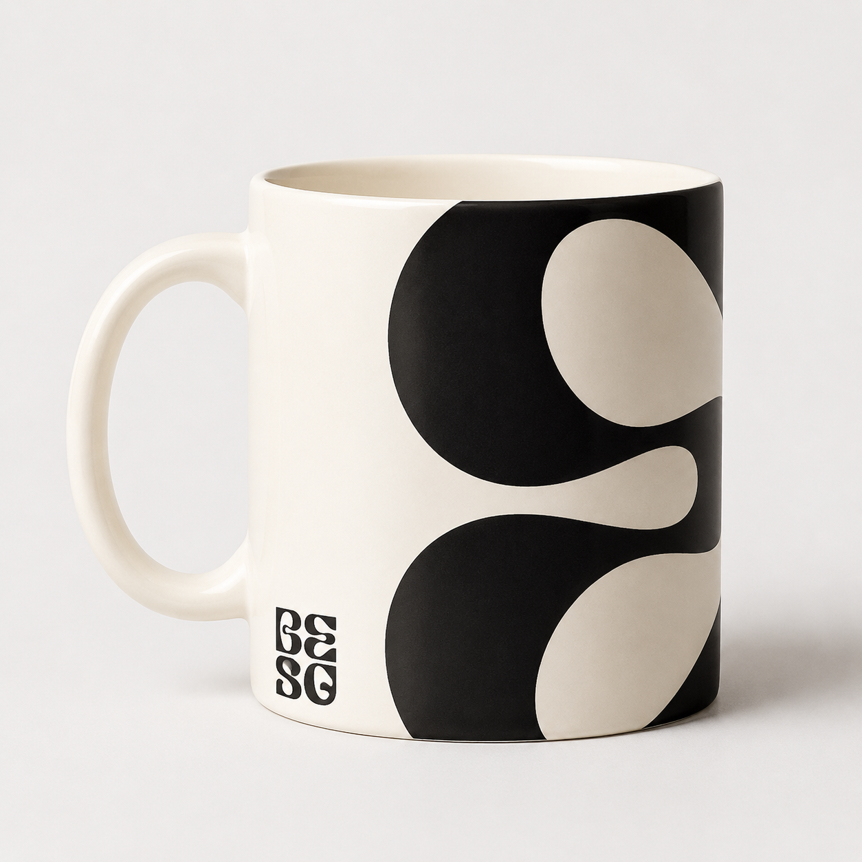
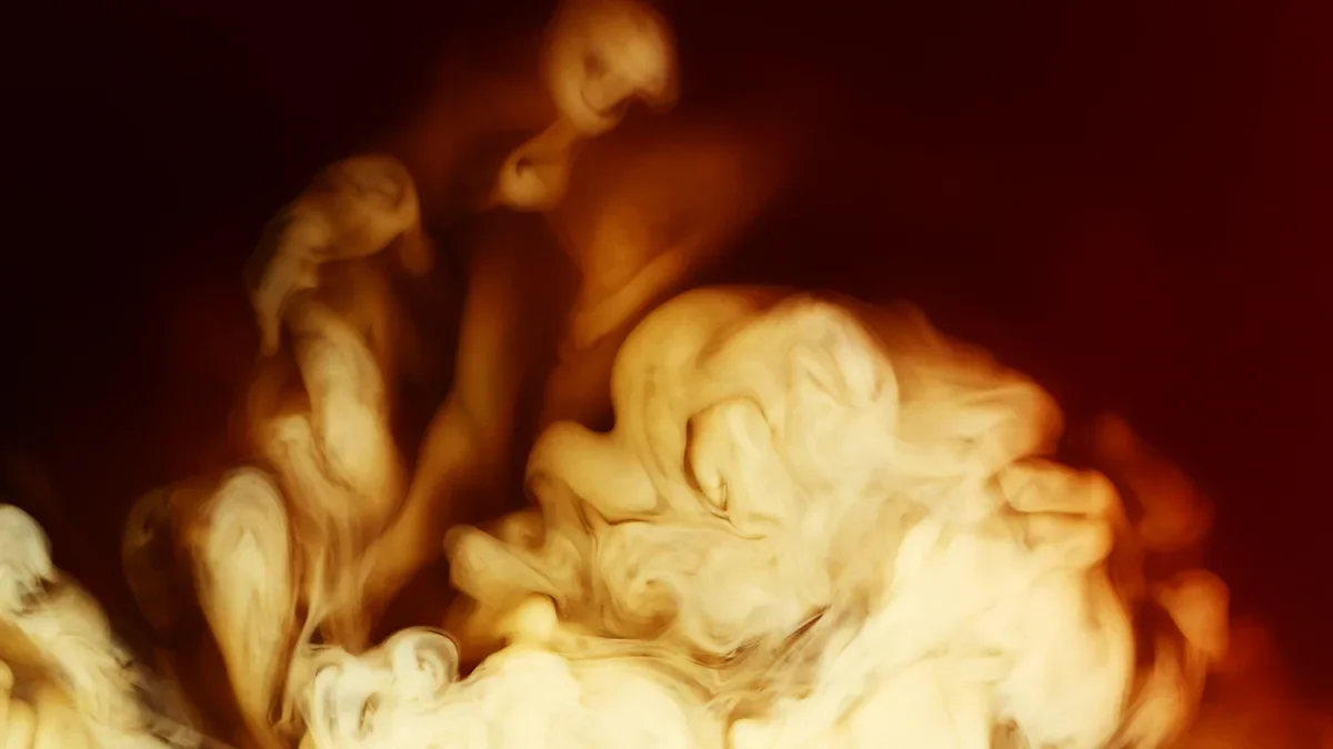
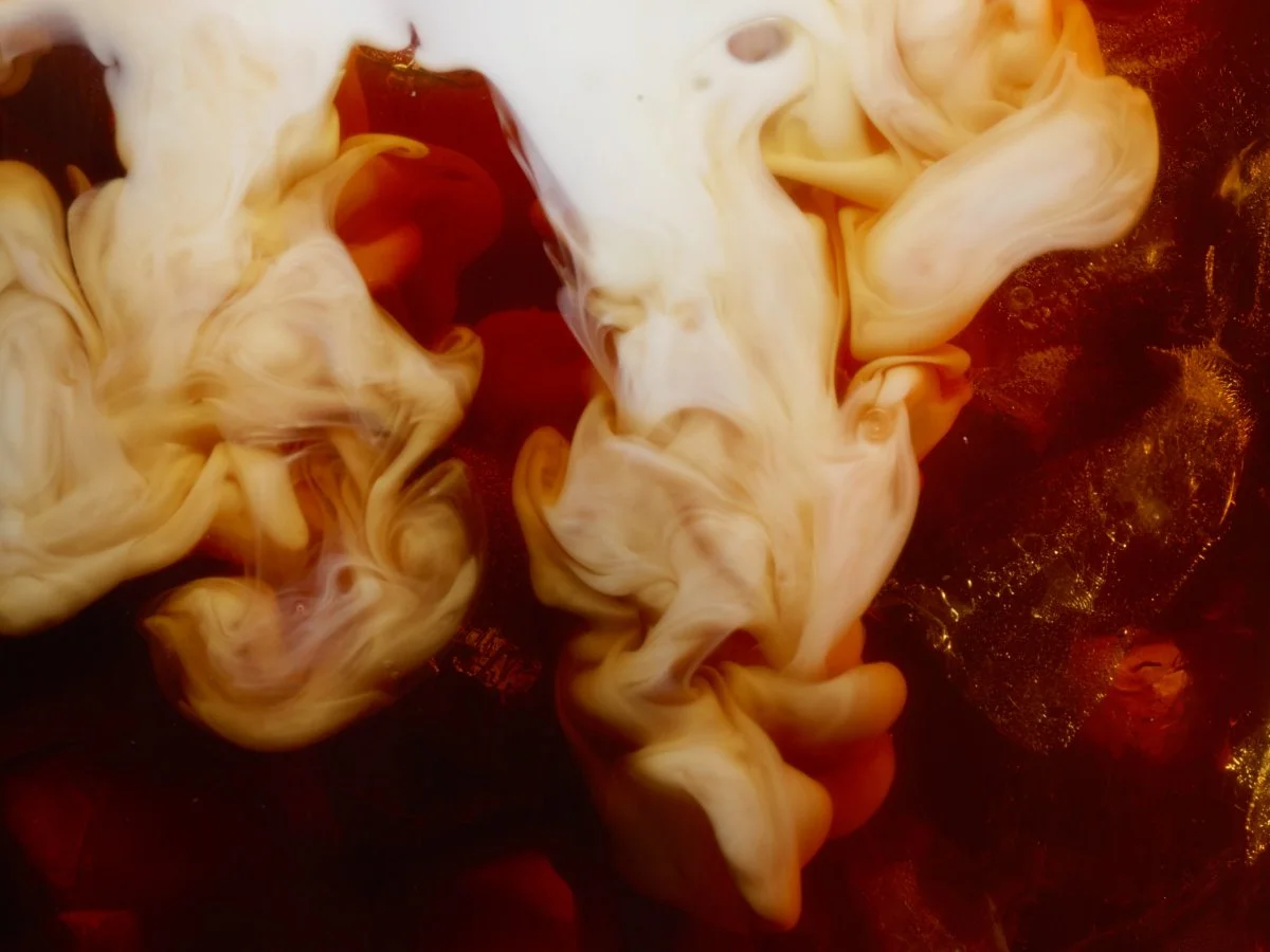
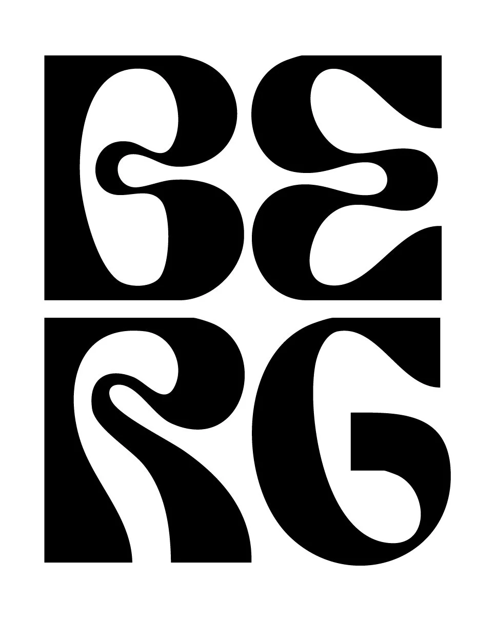
The Inspiration behind THE BERG’s logo mark came from the known aesthetic image associated with most coffee ads. The combination of milk and coffee. The contrast, the movement, and the abstract shapes are all created and form beautiful characters.
The font: BURRA Bold helps to capture these super interesting shapes, and helps to visualize this coffee experience in type.
What Does It Mean?
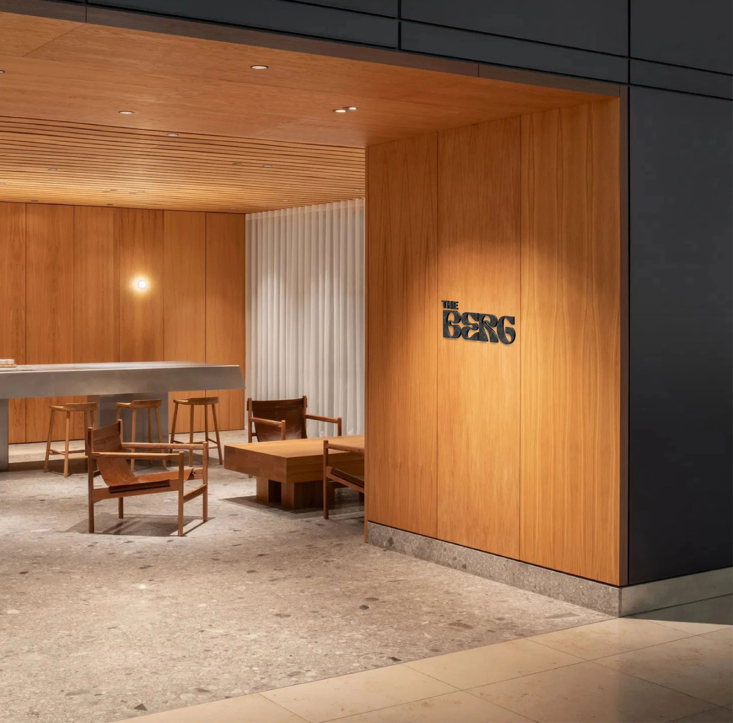
THE BERG
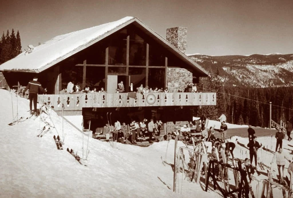
The name needed to be something abstract enough to feel luxurious, (pitched for a 4 star resort), while also wanting it to be associated with the community. Taking inspiration from one of the first lodges at the Breckenridge; the Bergenhoff, was a staple of the community from 1961-2013.
Keeping a piece of Breckenridge alive with this name, along with a slight nod to luxury, “THE BERG” currently only exists here. Waiting to be discovered.